 +92 331 6668187
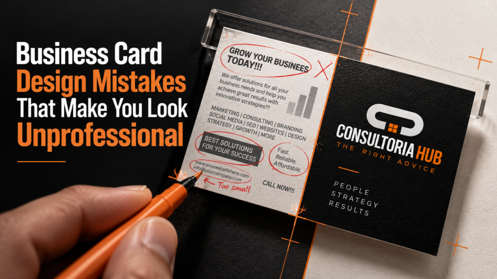
A business card is often the first tangible impression of your brand and a poorly designed one can quietly cost you credibility. Despite the digital age, business cards remain a powerful networking tool. Avoid these common business card design mistakes to make sure yours works in your favour.
1. Cluttered, Overcrowded Layouts
Trying to fit too much information onto a small card makes it hard to read and looks unprofessional. Stick to the essentials, name, title, company, phone, email and website, with plenty of clean white space.
2. Cheap Paper Stock
A flimsy card sends the wrong message. Thick, premium card stock with a quality finish, matte, gloss, spot UV or foil, instantly signals that your brand takes quality seriously.
3. Inconsistent Branding
Your business card should match your wider brand identity. Mismatched colours, fonts or logos across your corporate stationery and letterheads makes your business look disorganised.
4. Tiny, Unreadable Text
If people need to squint to read your details, the card has failed. Keep fonts legible and appropriately sized, and ensure strong contrast between text and background.
5. No Clear Purpose or Call to Action
A great card makes it obvious what you do and how to reach you. Consider adding a QR code linking to your website or portfolio for a modern, functional touch.
Avoid these mistakes and your business card becomes a genuine asset. Consultoria Hub prints premium custom business cards with a range of finishes, delivered nationwide across Pakistan.